01 Identity
Who we are. Who we are not.
The brand is quiet and exact. If a piece of work feels loud, it is wrong. If it feels safe, it is wrong.
We are
- Precise
- Confident
- Technical
- Calm
- Concrete
- Modern
We are not
- Salesy
- Boastful
- Cold
- Frantic
- Vague
- Trendy
Audience priority
SME owners and founders
Trading, logistics, F&B, light manufacturing, construction, retail, services, healthcare. GCC-based. They want one application, real options, days not weeks, no broker fees.
Lenders
Alternative lenders, NBFCs, banks operating in the GCC SME segment. They want pre-qualified deal flow, codified policy, and to skip the build.
Partners and press
Regulators, ecosystem builders, regional press. They want proof that the infrastructure is real and the numbers are honest.
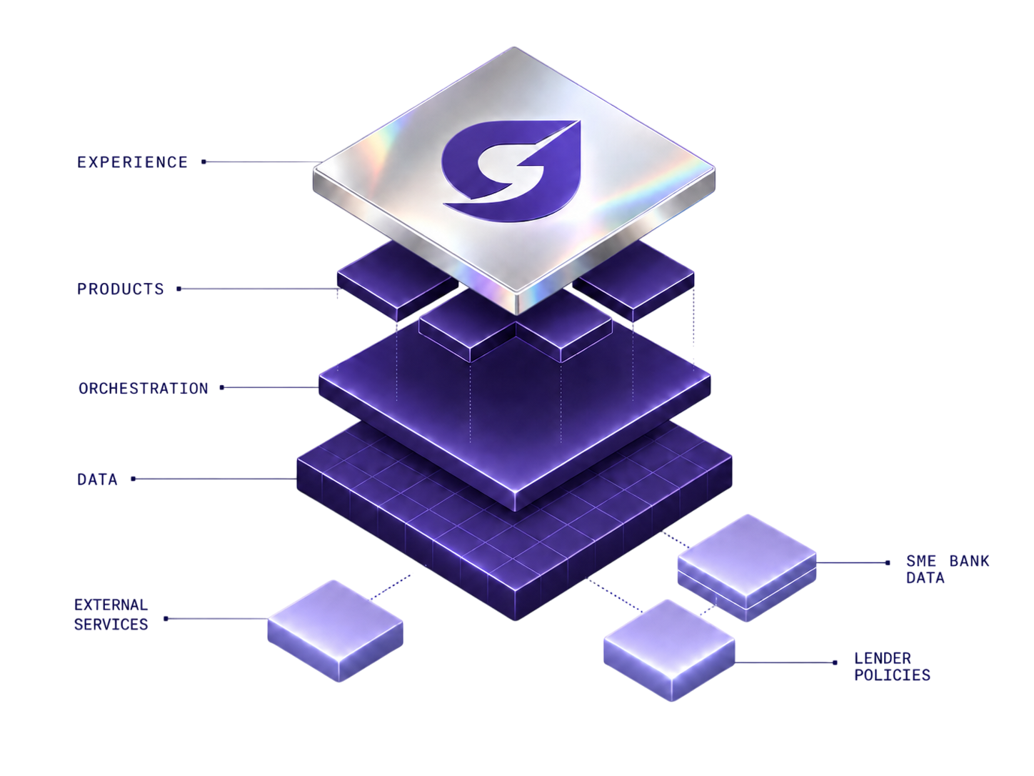
The product family
GiQ Match
LiveMatches SME applications to qualified lenders, ranked by likelihood of approval.
GiQ Pulse
BuildingLender-side analytics on portfolio performance and deal flow.
GiQ Originate
BuildingEnd-to-end origination. Document intake, parsing, risk profiling.
GiQ Passport
BuildingPortable SME financial identity. Reusable across lenders, renewals, top-ups.
GiQ Rails
2027Credit-as-an-API for the platforms SMEs already use.
02 Design principles
Six principles. Each is a rule.
Tested against every deliverable. If a piece of work fails one of these, it does not ship until it passes.
01
Restraint wins.
Quiet and exact. If a piece of work feels loud, it is wrong. If it feels safe, it is wrong. The brand has a low resting heart rate.
02
Type carries the load.
Hierarchy comes from size, weight, and tracking. Not from borders, shadows, or accent colours. Decoration is the last resort, not the first.
03
Purple is a moment.
The page is mostly air and ink. Brand purple appears, the eye notices, then the page goes back to quiet. Never a full purple wall outside the dark scroll area.
04
Materials are real.
Chrome reflects. Glass refracts. Lightning strikes. Crystal shards catch light. Every visual asset draws from one of four signature materials. No abstract gradients pretending to be a brand.
05
Motion serves comprehension.
Every animation has a job. Decorative motion is removed. Every transition is honoured by prefers-reduced-motion. Subtle wins over fast.
06
The grid breathes.
96 to 128px between sections. 60 to 75 characters per line. Whitespace is not lazy. It is the brand asserting that the content is worth the space.
03 Voice
The five rules. The vocabulary. The cadence.
Most brand work goes wrong in voice. Read this twice before drafting anything.
Rule 01
No em dashes.
Anywhere. In any deliverable that ships. Replace with periods, commas, parentheses, or sentence breaks. The em dash is a tell, not a style.
Rule 02
Antithesis cadence.
"X today. Y next." "X. Now Y." "X, not Y." Two beats are stronger than one paragraph.
Rule 03
Triple-period rhythm.
Three short declaratives often beat one long sentence. "Apply once. Funded in days. No broker fees."
Rule 04
Verb-led, active voice.
Lead with verbs. Cut "we" and "our" framing where the action does the work.
Rule 05
Concreteness effect.
Real nouns and named pain points beat abstractions. "3 to 10 days" beats "fast".
Approved vocabulary
Banned vocabulary
These do not appear in any GrowthIQ copy. Not as filler. Not "just this once".
Length targets
| Element | Target words | Sentences |
|---|---|---|
| Hero headline | 2 to 5 | 1 |
| Hero subhead | 14 to 22 | 2 to 3 short |
| Eyebrow | 2 to 4 | 1 |
| Section headline | 4 to 10 | 1 |
| Section subhead | 18 to 35 | 2 to 3 |
| Card body | 12 to 28 | 1 to 2 |
| CTA primary | 2 to 4 | imperative verb-led |
| CTA secondary | 2 to 3 | noun phrase or directional |
Before and after
Off-brand draft
Apply online and receive a term sheet from a wide selection of lenders who can offer financing solutions tailored to your business.
On-brand rewrite
Apply once. See every lender whose policy fits. Term sheet in days, not weeks.
Off-brand draft
Our innovative credit infrastructure platform leverages cutting-edge matching technology to deliver seamless origination experiences.
On-brand rewrite
One platform for the full SME credit stack. Matching, origination, underwriting today. Identity and embedded credit next.
Off-brand draft
Lenders work with GrowthIQ to receive applications that already fit their credit policy and to run the origination stack they would otherwise build alone.
On-brand rewrite
Receive applications that already fit your policy. Run the origination stack you would otherwise build alone.
Off-brand draft
Scale origination volume without scaling the analyst headcount that comes with manual intake. Capacity goes up, cost per file goes down.
On-brand rewrite
Scale origination without scaling the analyst headcount that manual intake demands. Capacity up. Cost per file down.
04 Color
Three families. Used in order.
Purple ladder owns identity. Neutrals are the canvas. Silver chrome and chromatic refraction are the premium signal. Click any swatch to copy the hex.
Purple ladder
Neutrals
Dark surface palette
Silver chrome
Chromatic refraction stops
Ice blue, lavender, silver core, warm cream, pink whisper. Animated as a sheen across silver. Hover-state only, never resting.
05 Typography
Hanken Grotesk for everything that breathes.
One sans for UI and body. One display reserved for editorial. One mono for labels.
Aa
Hanken Grotesk
Default. UI, body, headlines.
Aa
Source Serif 4
Editorial only. Press, founder letters.
Aa
IBM Plex Mono
Eyebrows, labels, durations.
The eyebrow pattern
For SME owners
Less paperwork. Better matches.
The eyebrow names who. The headline promises what. The subhead grounds it in a concrete pain point.
06 Materials
Four signature finishes.
The visual language of the brand. Every illustration, render, and surface draws from one or more of these. No exceptions.
Chrome silver
Polished metal with a cool tint, directional highlight, and a whisper of iridescent refraction at the edge. Lives on the StackDiagram chip, the LenderInteractive progress bar, and the logo silver variant.
Source: #CFD5E2 to #F7F9FD linear, with whispered iridescent edge.
Chromatic halo
The signature interactive moment. A silver specular core wrapped in three discrete chromatic bands that rotate. Lavender, brand violet, silver shimmer. This is the same CSS that runs on the StackDiagram on hover. Live, here.
Stops: #C4B5FD, #7C3AED, silver shimmer. 11s linear loop.
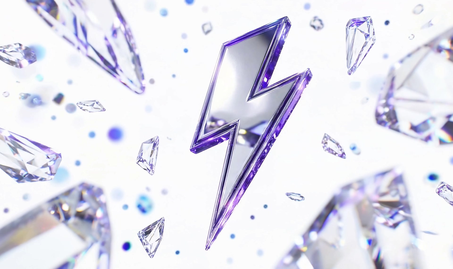
Lightning
Chrome core inside a brand-violet bevel, deepest at the lower edge. Cool sapphire sparks float around it. The home hero motif. Punctuation, not wallpaper. One lightning per page.
Chrome core #F7F9FD, bevel #7C3AED to #3B0764.
Crystal shards
Faceted geometric solids in lavender and clear, floating around a hero subject. Each shard catches light from a single directional source. The diamond field surrounding the hero lightning. Always cool-toned. Always partial, scattered, never centred.
Palette: #F4F1FF, #C4B5FD, clear.
Background texture
Faint isometric grid in brand purple at 5% alpha, 32px cell. Masked with a radial gradient so it fades at the edges. Used on hero surfaces like the StackDiagram panel and the Journey timeline. Never on body content.
Imagery rules
Yes
- 3D renders in purple, silver, lavender palette
- Chrome with directional light
- Glass with chromatic dispersion
- Lightning, crystals, diamond shards
- Cool backgrounds with faint isometric grid
- Iridescent ribbons and flows
No
- Stock photos of business people
- Hands holding phones
- Office shots
- Generic abstract gradients
- Warm orange or yellow palettes
- Money, banknotes, coins
07 Composition
How the brand lays out on a page.
Six layout patterns cover ninety percent of the site. Each pattern has a purpose. When in doubt, copy an existing section, do not invent a new pattern.
Two-column, 5 fr / 7 fr
Copy left, hero visual right. Used on the StackDiagram section. The visual gets the larger column.
Two-column, 7 fr / 5 fr
Big headline left, supporting lead right. Used on the Journey timeline header.
Two-column equal
Step accordion on the left, image on the right. Used on the SME and Lender step sections.
Three-column
Card grids. Audience cards. Features. Equal column emphasis.
Four-column
Journey timeline stages. Stats row. Each column is one beat in a sequence.
Centered hero
CTA blocks. The North Star quote. Single-statement moments.
Surface treatments
Card
#FFFFFF background
1px border #EDEEF1
radius 16px · shadow-md on hover
Glass panel
#FFFFFF at 92% opacity
backdrop-filter blur(28px) saturate(180%)
1px border at 8% black
Dark gradient
#160A26 → #25103E → #1A0B2E
radius 24px · 8px outer margin
Silver chip
#F4F1FF → #C4B5FD → #7C3AED
inner highlight at 70% white
drop-shadow brand purple at 25%
Border radius scale
--radius-sm
6px
Tiny chips, badges
--radius-md
8px
Form inputs, dropdown items
--radius-lg
12px
Buttons, active accordion items
--radius-xl
16px
Cards
--radius-2xl
24px
Hero surfaces, image panels
Shadow stack
shadow-sm
0 1px 2px rgba(0,0,0,0.05)
shadow-md
0 4px 12px rgba(0,0,0,0.08)
shadow-lg
0 8px 24px rgba(0,0,0,0.10)
Negative space rule. If a section feels crowded, the answer is more space, not less content. 64 to 80px between content blocks. 96 to 128px between sections. 60 to 75 characters per line on prose. The page should feel like more space than content.
08 Logo
One mark. Two variants.
The horizontal wordmark. Full colour on light. Silver on dark. Never recoloured. Never stretched. Never placed inside a shape.
 Light · Full colourDark · Silver
| Context | Minimum height | Typical height |
|---|---|---|
| Web navbar (desktop) | 24px | 30px |
| Web navbar (mobile) | 20px | 24px |
| Web footer | 28px | 32px |
| Email signature | 24px | 28px |
| Social avatar (G mark only) | 96px | 256px |
| Favicon (G mark only) | 16px | 32px |
Clear space. Reserve a margin of 0.25× the logo height on every side. At 30px tall, 8px clear space. Nothing crosses it.
Misuse. Do not recolour the G mark. Do not stretch the aspect ratio. Do not place on busy imagery without a solid backdrop. Do not place inside a circle, square, or tile. Do not type "GrowthIQ" instead of using the SVG. Do not animate the wordmark.
09 Components
Live, as they ship.
Rendered from the production CSS. What you see here is what reaches the page.
Buttons
One primary per section. Two CTAs (primary plus secondary) only on the hero. Hover triggers the vertical text-flip and the 3px arrow nudge.
10 Motion
Calm. Decisive. Serves comprehension.
One easing curve. Three timing tokens. One signature sheen. Reduced motion is honoured everywhere.
The chromatic sheen, live
Silver chrome base · cool ice → lavender → silver core → warm cream → pink whisper · 2.8s linear loop
Easing and timing
| Token | Value | Use |
|---|---|---|
--ease-out | cubic-bezier(0.16, 1, 0.3, 1) | Default for everything |
--duration-fast | 150ms | Hover background, small toggles |
--duration-normal | 300ms | Default transitions, color shifts |
--duration-slow | 500ms | Image fades, section transitions |
| StackDiagram tilt | 600ms | 3D tilt return |
| Chromatic spin | 11s linear | StackDiagram glow rotation |
| Progress sheen | 2.8s linear | Progress bar shimmer |
| Navbar theme switch | 320ms | Light to silver inversion |
11 Spacing
A 4px-stepped scale.
Use tokens, not raw pixels. The bars below are to scale.
12 Cheatsheet
The minimum to remember.
Pin this above your desk.
Voice
Em dashes: 0 Banned words: 0 Antithesis: Every section Triple-period: Where it fits Verb-led: Always Geography: GCC, not "the region"
Color
- Brand purple
#4C1D95 - Bright violet
#7C3AED - Deep aubergine
#3B0764 - Mid lavender
#A78BFA - Light lavender
#C4B5FD - Background
#FBFCFD - Text
#1A1A2E - Subdued
#6B6F80
Type
Sans: Hanken Grotesk Serif: Source Serif 4 Mono: IBM Plex Mono Eyebrow: 12px mono, uppercase, 0.18em Body: 16px sans, line height 1.6 Headlines: Sentence case, -0.025em
Logo
File: /public/GrowthIQ.svg Aspect: 4.32 : 1 Navbar desktop: 30px tall Footer: 32px tall Silver variant: filter: brightness(0) invert(1) brightness(0.96)
Buttons
Primary: Brand purple, white text Secondary: Glass, brand purple text Default height: 56px Navbar height: 44px Radius: 9999px (pill) Hover: Text flip + arrow nudge
Motion
Ease: cubic-bezier(0.16,1,0.3,1) Fast: 150ms Normal: 300ms Slow: 500ms Reduced motion: Always honoured
Source of truth. The live site at growthiq.ae. If this document and the site diverge, the site is right and the document needs updating.
Questions, drafts, proposed changes. brand@growthiq.ae.